
LIDAR Visualisation Tool
Desktop software that lets engineers find errors arising from the difference between how autonomous cars see the world and how humans see the world!
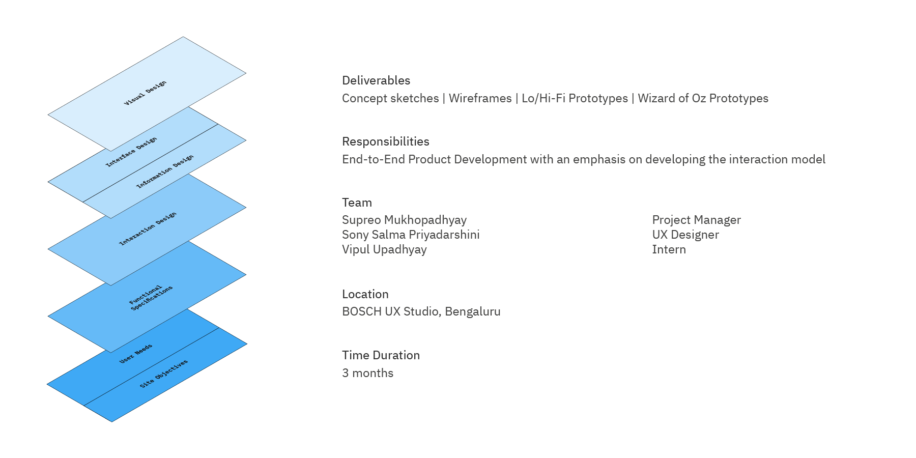
What is a LIDAR Sensor?
LIDAR(Light Detection and Ranging), simplistically a laser-based radar, is a sensor that is used to generate high-resolution 3D point cloud maps of the surroundings. It is central to most autonomous driving systems.
What are you making?
We're designing the visualisation and feature set for a system that can visualise live or prerecorded data for autonomous driving development engineers. This would be powered by a ROS(Robotics Operating System) back end and would act as a replacement for rviz.
Does it not exist?
Since the domain is relatively new there is a lack of purpose built usable tools. Most tools are adapted from robotics software with reliance on code rather than a software interface.

“To make desktop visualisation software that can be used by developers across the whole LIDAR vertical from hardware testing to client issue redressals”
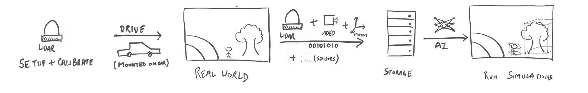

Our users are engineers working in the development of Autonomous cars. The lack of existing software made it hard to get a flow of what the users do. We managed to get some of the general tasks that the employees do which are listed as follows.
The users were identified in three different sections of the vertical:
- The Hardware Level
🏢 Work in a lab
🚨 Live data from LIDAR sensor
❓ Optimise hardware output
🛠️ A workstation | Development interface for hardware changes | Calibrated Test objects
📜 Calibrate new sensors | Compare input data against standard models | Run measurements
- The Data Recording Level:
🛣️ Work on a test track in a 🚗
🚨 Live data from LIDAR sensor
❓ To record high quality data
🛠️ Single monitor display | Hardware console with knobs and switches
📜 Monitor and optimise recording performance
- AI models level/client issue redressal
🏢 Work in an office
🚨 Pre-recorded data from LIDAR sensor
❓ Fix algorithmic issues | address customer complaints
🛠️ A dual monitor setup | server level computing power | Development interface
📜 Run simulations on existing data | Identify errors in Perception, Path planning, Prediction | Fix them using the development back-end of simulator
“To create a desktop visualisation software that lets engineers find and analyse the difference between the way humans see the world and how autonomous cars see the world” -Design team brief

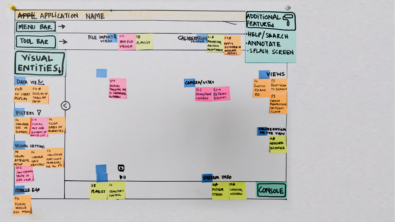
The user task flows were broken down into smaller steps. For those steps, basic tasks were defined. These were constantly discussed with the users and the development team to refine their needs and feasibility respectively.

This is a new domain that deals with large sets of high dimensional data that varies in time and space. To be able to interact with the visualisation & use the tools there is a need for them to be predictable without being overwhelming. The lack of existing interaction patterns in this domain led to a mix of patterns from Maps, GIS, 3D modelling programs, Media Players, data-oriented software and development environments. In making software for professionals, the balancing act was between making it easy to learn and efficient to use over time.
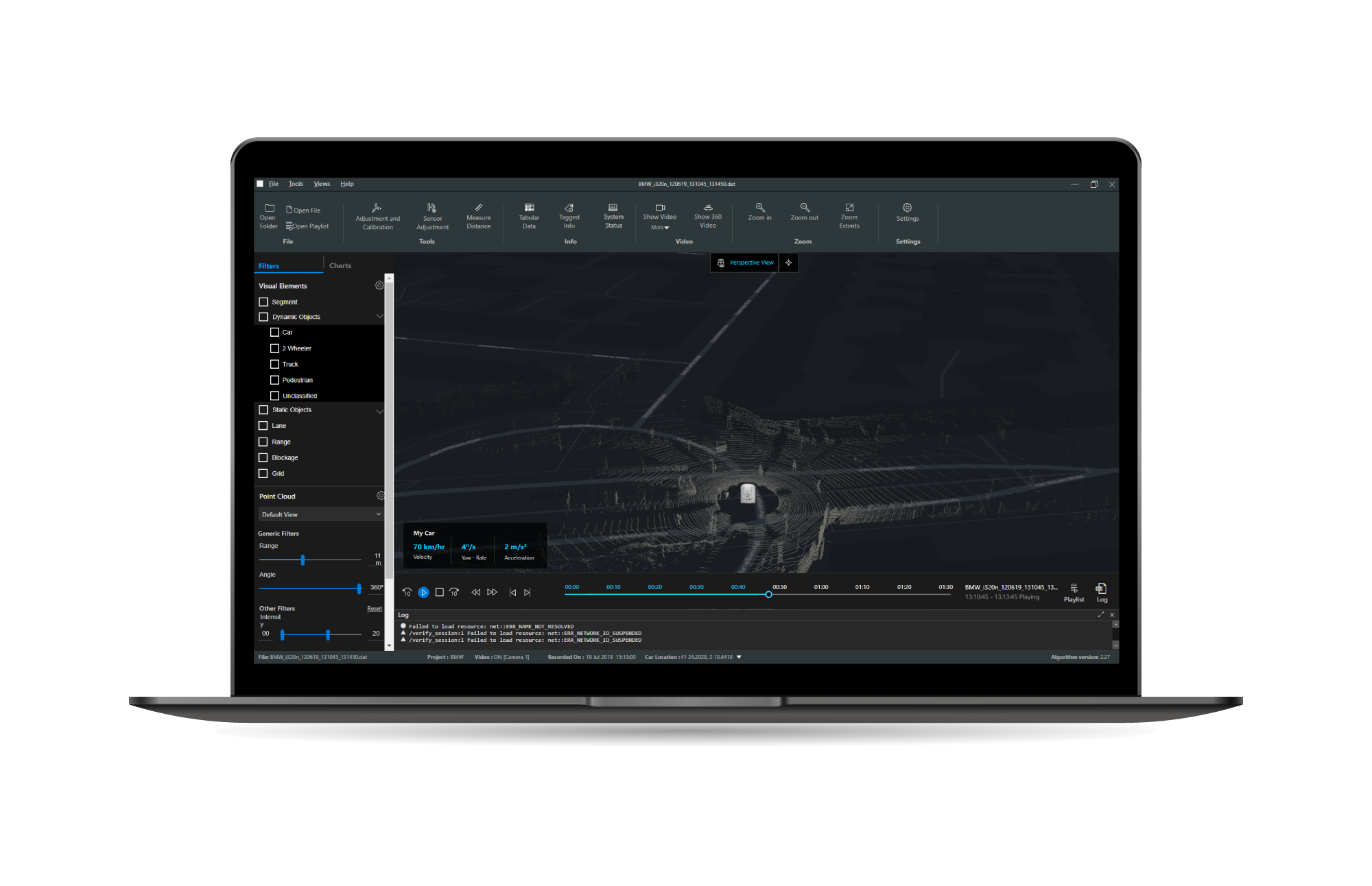
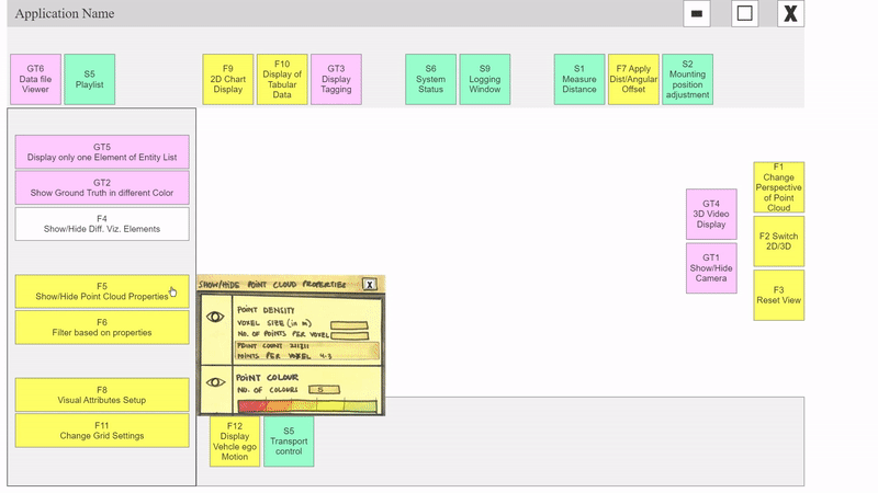
Detailing: 🔘 Buttons v/s️ Sliders 🎚️

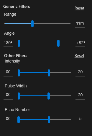
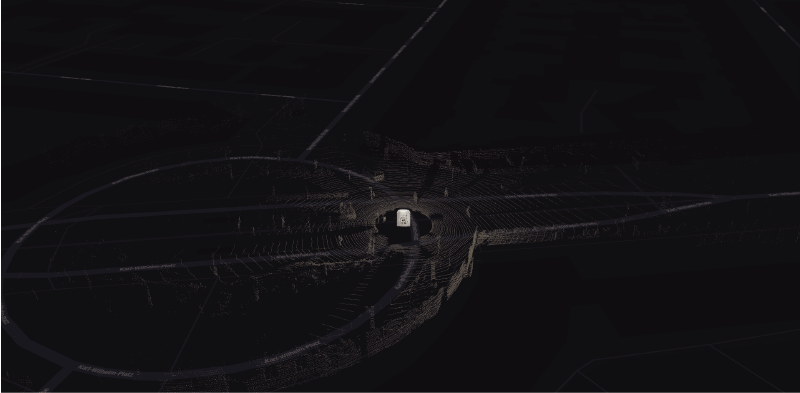
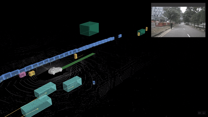
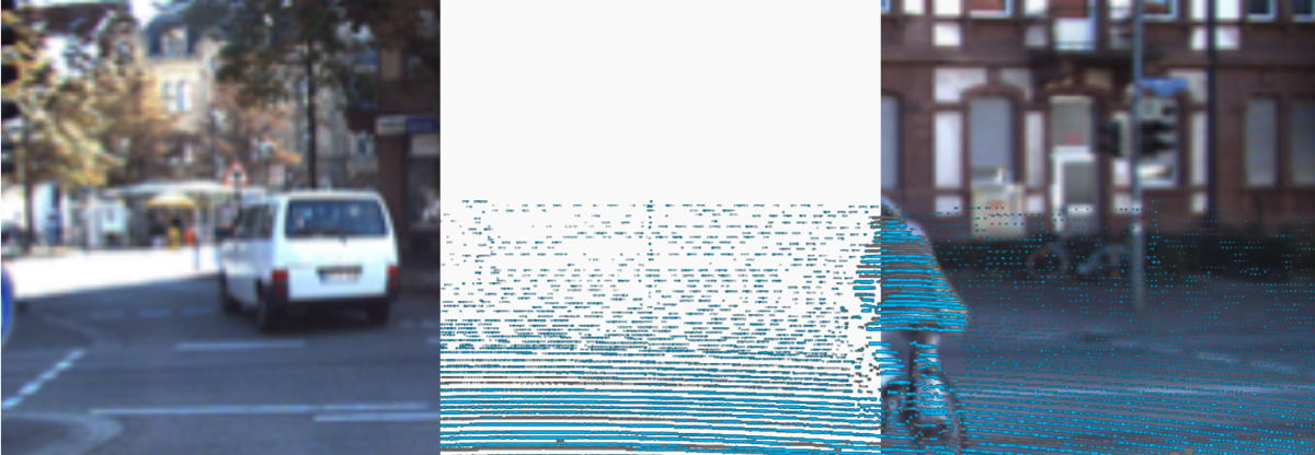
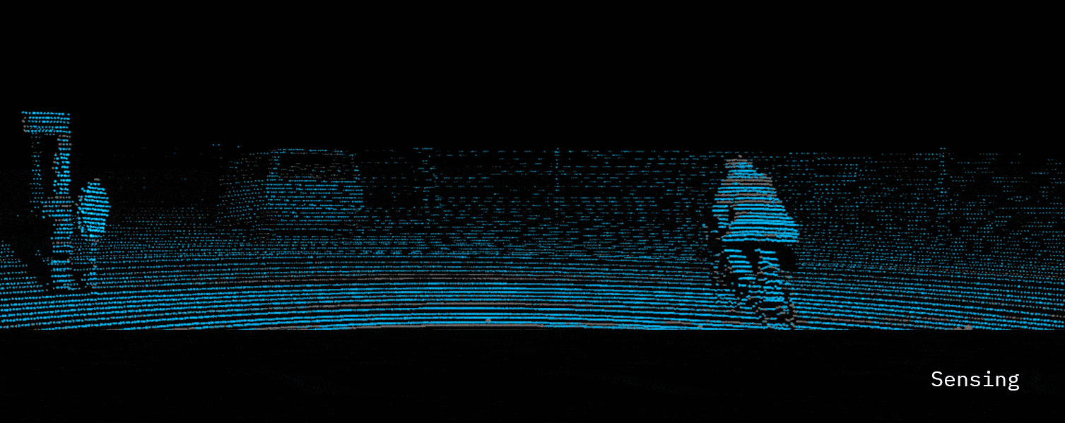
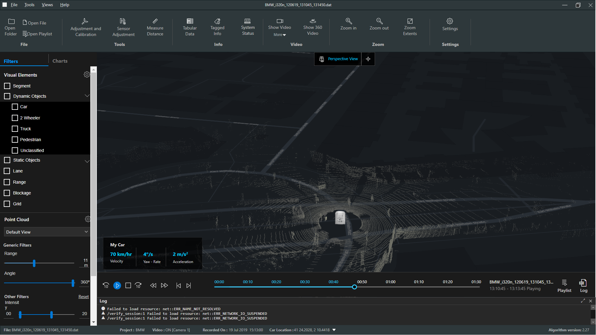
The point cloud consists of millions of tiny dots each representing a data point as measured by the LIDAR sensor in space. They contain a number of parameters inside them like Intensity, Echo number etc. These panels offer the user a way to filter part of the point cloud. This is helpful to look for errors or as a debugging tool. It also helps in reducing the cognitive load and focus on particular parts of the large data set. In this case, the lack of any defined process for debugging and the semi-exploratory nature of the tasks gave rise to the tension of Buttons v/s Sliders. Buttons are superior when it comes to finer control(provided the offsets are set correctly), while sliders provide a much more exploratory organic feel. This was something the users had a hard time deciding between as well. Keeping in mind that they have another set of tools like Measure which are much more exact if need be, the decision was made to retain the sliders but with number-fields to pinpoint exact values.
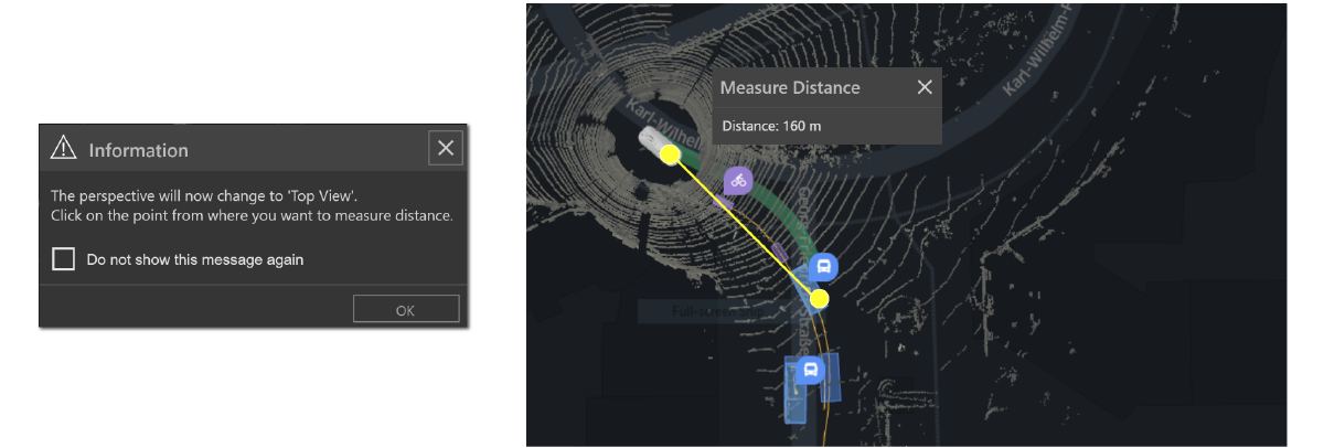
Detailing: 📏Measure Tool
A measuring tool at first glance seems innocent enough right? You select two points and you get the distance. But let’s look deeper(literally, 😝). Now the two points are in 3D space which you are seeing on a 2D plane. You are not only dealing with one point of view but any number of infinite possible ones. Now, selecting the two points is a little harder. Then do you just give a smart technically inclined engineer just the direct distance like a peasant? Or do you provide a vector between the two? While you’re at it, add to that a good ol’ distance along the ground because it seems useful too(because the car literally drives on the ground, at least for now). Now you’re giving the poor woman too much information. She just wanted a no-frills distance measurement.
Wait, there’s more. We also have tagged data, remember that fancy AI identifying a car from a truck and a child from a pole, all by looking at a bunch of dots? If that’s not enough, what if the engineer wants to track the distance between her car and another one next to it, dynamically, while the cars move. But that distance can also be calculated in various ways. Sceptical? Well, it can be the distance between the centres of the cars; it can be the minimum distance between them or the maximum one?
All of them seem so useful but so complex at the same time, right? So much for a simple measurement tool! After thinking through and discussing these possibilities for half a day, we decided to ask around. While the users appreciated that many ways to measure, and being of the curious sort, loved the possibilities. Among the stakeholders, it was decided to implement only a simple, along the ground measuring system for now. The other ideas would be taken up in later versions. What the discussion did help to clarify was that this could only be done accurately from the Top View(which was a detail that had completely missed the users). The implementation of this was rather trivial afterwards.

Information design played a large part in the application because there was a lot of data that needed to be visualised such that it informs rather than overwhelms while maintaining enough granularity to be able to see issues and find the details of the same.
Detailing: 📊 System Status Monitor


The status monitor was designed such that it could provide a system overview without having to look into the details. Coloured traffic light style symbols were chosen to represent the various states of the hardware, software, storage and computation equipment(omitted here). The main intent was for it to be used on a separate second monitor for passive referencing or as one of the main tools for in-car recording sessions.
Detailing: LIDAR Visualisation type 🔮

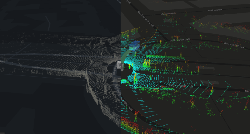
The point cloud can be visualised in a number of ways because of its high dimensional nature. Being a very technical feature, to select these visualisation types we consulted with LIDAR & autonomous driving experts to match our use cases with the right kind of data. This was then visually represented through solid colour(s) or gradients(hue/saturation/brightness) to match the data semantics appropriately.
Challenges
The design depended on detailed technical specifications from the user side and the implementation by the development team. It was challenging to achieve this because of the very nascent nature of the project. The engineering processes and technology to be implemented were in a state of constant flux, which resulted in a lot of uncertainty. The current version resulted from a demanding back and forth between all stakeholders mediated using sketches, mock-ups and prototypes.

Process: From card sorting to the final layout 🗂️

Detailing: 🎥 Show Video 🎥
We based our design on the assumption that there is a single camera feed. In later discussions, we discovered that there are up to 6 different ones with a need to monitor multiple at a time. The camera setup varies in focal length, placement on the car and the ability to stitch edges together. The challenge was to maintain the orientation for the user and form a coherent view of the surroundings. We proposed various solutions in consultation with the development team which tried to strike a balance between cognition, computation and visual space.

Out of these, the exact one would be finalised later when the software becomes more mature and is in the fine-tuning stage of development. However, this was one interesting problem that did not reach a conclusion while I was there.

In the duration of my internship, minimal visual design was done. We chose Microsoft’s Fluent Design system for the time being as a prototyping aid. All prototypes were made using Axure RP8
Note: Some images have been replaced with equivalent/similar ones taken as is or modified from publically available Uber AVS purely for communication purposes, due to the originals being Bosch IP.